Wednesday, November 7, 2012

Presentation and presentation outcomes

my presentation went well. I will use the medium of video with voice recording again as it helps with my nerves ( however is a little embarrassing listening to yourself)

my feedback from Peter was regarding some of the final touches on the floor plan; in particular the possible addition of a retaining wall and small courtyard in the eastern facade, lower mall level. this would provide more light to the lower level and also gives opportunities to grow some screening for the upper levels.

Overall im happy with both my presentation style and how it went. and on top of this I have learnt some new skills.

Monday, November 5, 2012

in the future this will be a visible community

Up cycling= taking waste and forming it into something of greater use or value; I would also add giving it a value. ( in some instances not necessary to change it in form or function at all just clean and reconfigure or re finish)

interesting look at one upcylers work as well as the environment that he lives in.

http://www.youtube.com/watch?v=2acPOB1-i-I

Sunday, November 4, 2012

the story

Macro- brisbane

how its often known in australia for a lack of culture however an underground culture of artisans etc is emerging

Paddington- how it is the antiques and furniture district 2 km west of the city. one of a few Artisan culture hotspots in brisbane

Micro- the site- has history of upcylcing and being a depot for trams.

my proposal
- plan
- form
- section ( circulation, structure etc)
- elevation (context)
- experience ( renders etc)

voice over so that presentation is seamless storytelling - architectural fiction.

renders and photo montages


The story of moving through the space:

 starting possibly at dropping something off at the recycling depot


 once there the user may source  materials for a new project
 they may go home or to the workshop to work on these projects and interact with other artist apart of the community.
 meanwhile people maybe watching their process in the cafe as they research what the want to buy


here are some of my renders and photo montages.

Saturday, November 3, 2012

final section

here is one of my final section. This one shows allot about how the building will function.
to the right you see the lady in the red pants. this is the repeated character im going to use throughout all of my renders.

she is entering from the residents car park to the residents front doors; situated behind the retail.
in the section of the housing/ retail you can see a resident sitting in her loft on the computer as she watches what is going on downstairs in her retail space. the couple in the walkway have just dropped something off for recycling and are now going to look at what they can buy to replace it. The group of people are watching what is going on in the workshop (and eyeing of the set of Eames chairs on the mezzanine level)

it also shows how the building related to the street level at all entrances.

final plans,


here are my final plans photoshoped and then made axonometric to show their relationship to eachother


final plans,


here are my final plans photoshoped and then made axonometric to shoe their relationship


Friday, November 2, 2012

symbols

in order to graphically represent what Im talking about quickly and efficiently throughout my presentation i designed some graphic symbols. these are just the colour pallet chosen before then an image drawn for each theme and the colours inverted then put into the circle.

 the result :


presentation colour scheme

firstly I decided on the layout for my presentation-

going along with my goals for the presentation I decided that white backgrounds with bold colours simple diagrams and symbolic representation

the colours I chose are bellow :


I then categorised the content of my presentation ; as seen above

Thursday, November 1, 2012

The Depot sections

East elevation 

North elevation 

these elevation needs some work on the structure which is currently being done. Will re post final sections and elevations later
section north- south; living and cafe
workshop bellow ( with garage doors)
and car park bellow that with services isolated( behind doors)

section west-east ; front view. I probably wont use this in my presentation because all of the transparent surfaces make this pretty confusing. 

section through living/ loft area. good section but needs more context.

this will probably be the section i end up using the most .
section south-north through workshop (both levels) and shows relationship to retail and loft living.


form

from the floor plans the form needs to then be analysed.

this shows some of the steps I went through to arrive at my form and shows how it will be presented in my final presentation.

all steps will be included in my presentation and be animated.


The Depot plans

from my feedback from the last set of plans I showed peter I have made some changes and re drawn my plans. circulating through the different levels now works much better. The housing is now loft style therefore integrating the experience of being inside an artists home into the experience for shopping for the finished product.


im happy with the floor plans, during their design everything seemed to be placed in its place in relation to something else in the floor plan being where it is... if that makes sense?
Anyway I think the result is a resolved set of plans.

Wednesday, October 31, 2012

presentation process

I had to stop drafting today as I need the next week to learn how to do / do my presentation. My personal focus this semester is getting the most out of honing and improving my presentation skills.

The style of presentation that I aim to achieve will have elements taken from a number of effective presentations I have seen throughout my 4 years studying.

principles for my presentation.

- simplicity: I want my presentation to read like a simple story. with no extra information but all questions covered.

-graphic- I want the images in my presentation to work with the spoken explanation but also enrich it by providing more information not just an exact image of what im talking about

- stylised - I want my presentation and board to talk to each other and my building to inform this style.


Friday, October 26, 2012

Tutorial feedback

today in tutorial I showed peter my preliminary plans.

UPPER LEVEL - ARTIST HOUSING

LATROBE TRC LEVEL- RETAIL AND PUBLIC AREAS

LOWER MALL AREA- NOW FRESH FOOD AND PERISHABLES MARKET


Peter seemed pleased with my progress. The main thing we discussed was the space in section in relationship to the experience of the space and how the 'beauty' of the scheme lay in the relationship between the artists living space and the rest of the spaces.
EXISTING SECTION (REV A)

from this we decided that the workers dwellings should be more integrated and more visible almost like a loft above the shop front; these drawings were produced whilst talking about this to highlight this loft relationship.


Tuesday, October 23, 2012

Presentation - precedence studies


For  my presentation I often find that my nerves get the better of me and mean that I am unable to communicate my ideas to the best of my abilities. therefore for this presentation and the freedom given in presentation styles Im going to try to produce a 'complete package' video that includes all of my speaking. This way I will just have to engage in the conversation and feedback after my presentation ( which for some strange reason i never seem to be as nervous about. Im going to use the skills I learnt in second year re. movie making; it will be interesting to see how I go!!

here are some precedence studies for the type of presentation I would like to produce
http://www.youtube.com/watch?v=ZNaV5_8KlEM

some nice renders/ images in this one however the concept is a bit loose - http://www.youtube.com/watch?v=998VaxHNyjI

This one is awesome because it really tells a story however still includes the architectural information needed. - http://www.youtube.com/watch?v=01uusJROszY&feature=relmfu


Friday, October 19, 2012

Tutorial Feedback

last tutorial I was a little bit stuck. I got my program understanding early this semester and then felt a bit like i was stuck and didn't know how to proceed. So this week I changed tacts and started looking at the CRA very closely and looking at how I would present my ideas in the hope that it might spur me onto the next stage of my project. I went through all available information on black board as well as those goals discussed with Peter during tutorial and have come up with this rough plan; more of a mental map of the projects response to the CRA


Thursday, October 18, 2012

initial elevations

In section and Elevation the building will change the most. Allot of spaces that are currently subdivided will be opened up to serve a single function. The building will have less functions however they will be more interrelated.


The floor plan has been designed so that function move through the centre in a logical systematic order; one end (west) dedicated to the raw product, the centre the working and lastly the retail space and customer experience.

The large awnings have been kept as they define local identification of the centre and they are also industrial looking in keeping with the new centres function. The rest of the building will take these existing elements as a visual cue.

Tuesday, October 16, 2012

Assessment criteria

Last tutorial we went through the assessment criteria and defined how we would be assessed and how we aimed to meet the criteria. This was written down and given to our tutor.

This is mine :

Friday, October 12, 2012

Tutorial feedback

I showed peter during the tutorial what I had done so far re the floor planning sections and elevations and he was encouraging as to what I have produced so far. Peter recognised the push for Icon and branding in my design and agreed with this also. From here I will begin to model it up more permanently and I also want to look into the best and most effective way to present this work.

I have been saying Measured plans would also be good, and we have now got them so I will also try to revise all my plans so far to the measured drawings provided.

Wednesday, October 10, 2012

Here is some research I've been doing regarding consumer shopping behaviour; of particular importance is current trends in homewards and furniture.


http://www.clickz.com/clickz/column/2117760/learning-3s-school-digital-space. viewed 11/11/12

And looking at cross- shopping where consumers are likely to research online then buy in store here are some current statistics.


  • 47% of online shoppers will research their next furniture purchase online, but will buy it in a brick-and-mortar store. Source: PriceGrabber.com
  • Retailer store sales influenced by online research are three times higher than total e-commerce sales (an estimated $132.4 billion in 2008). Source: eMarketer.

French, D. http://www.furnituretoday.com/blog/Research_Says/26120-The_cross_shopping_phenomenon.php. viewed 11/11/12

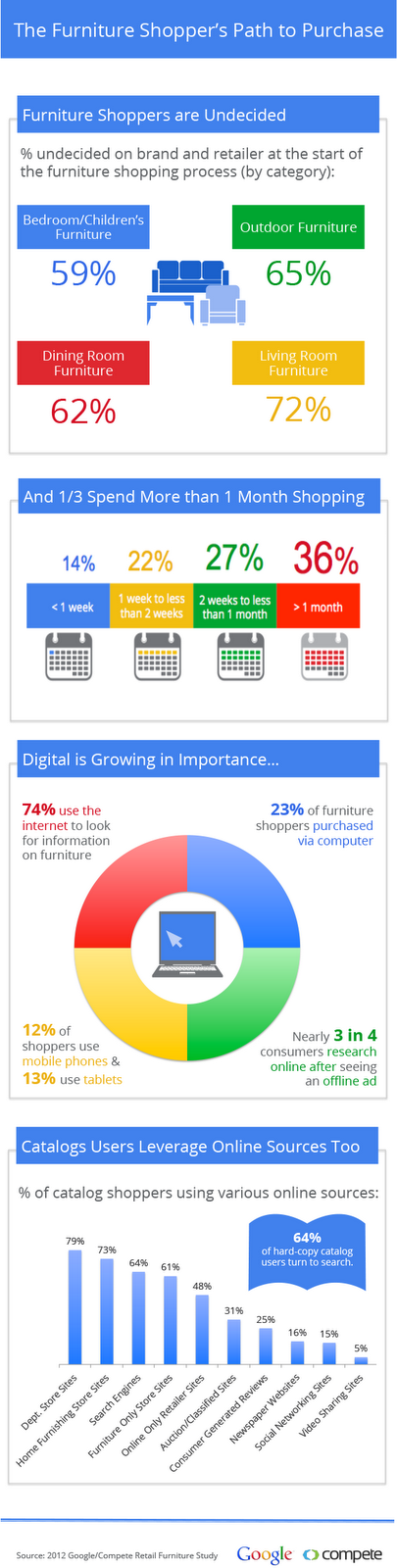
and lastly although you cant trust it to be very transparent as its purpose is to sell online shopping here is what google research says in relation to online furniture shopping.


Google retail advertising blog: http://googleretail.blogspot.com.au/

so what this all tells me is that as consumers get more comfortable with the internet and internet shopping a majority of retail purchases will take place online however in the furniture market the main purpose of the internet is research. people still want to go and 'check' their furniture purchase; possibly because it is often quiet a large financial investment. So, in relation to my assignment, by providing the 'research savy' consumer with an outlet to literally watch the furniture being built in the same space as buying the furniture then this will capture a large share of the furniture consumer market in the future.

Tutorial outcomes

During the tutorial last week, Peter and I discussed the implications that my proposed upcyling workshop would have on the existing architecture. we discussed the need for a hierarchical arrangement of spaces; with the workshop at the top of the hierarchy and all other spaces having a complementary and/ or supporting role within the building. Discussed in section, it was decided that the workshop should be the central space, elevated so as to be visible from a range of perspectives.

Images to come ....

Sunday, October 7, 2012

Worked Elevations

Taking their cues from a number of needs the elevations seemed to evolve by themselves.


The existing awnings as well as the function of the centre gave it an industrial program and therefore a strong industrial theme amongst other themes seemed necessary . This can be represented using visual structure, steel work and large open plan design. In order to function as a centre that draws the community and that people will visit, not only for buying furniture, the centre needed attractive branding. Being a recycled furniture depot and workshop essentially, a retro theme seemed appropriate; this also fits in with the surrounding character architecture. Inspiration coming from the iconic 50's and 60's gas station design, this idea for 'paddington depot' is born; also providing brand opportunity for future 'depots' in other suburbs and cities. 


When the upper level in no longer needed it allows more freedom to the ground level. the workshop which needs to be visual has been raised slightly. There is also a contrast in the centre between spaces that are public and encourage viewing and those more private. This contrast is emphasised with heavy concealing cladding or screening on those spaces not for viewing and the use of transparent materials where viewing is encouraged. The roofline form comes from the exposed trusses that were existing at the eastern throughway of the building. This roof connects and whole centre and defines its form.